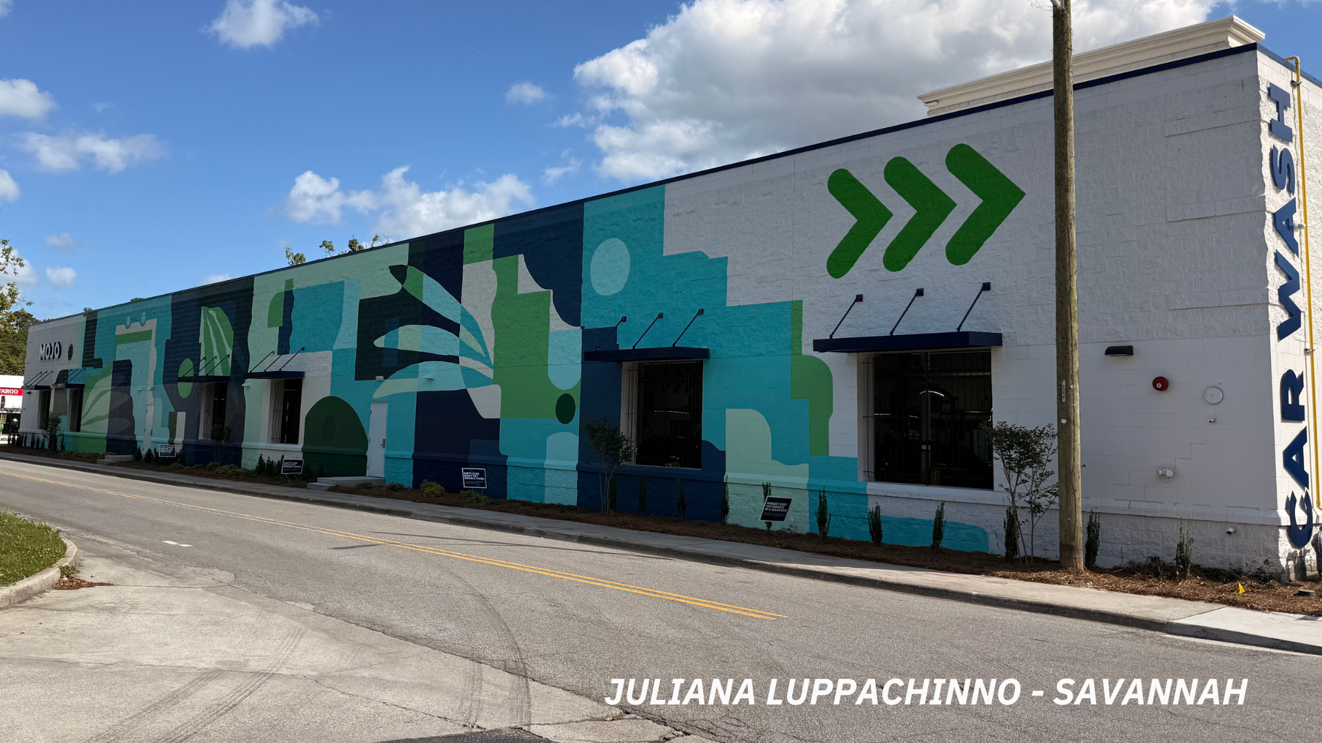
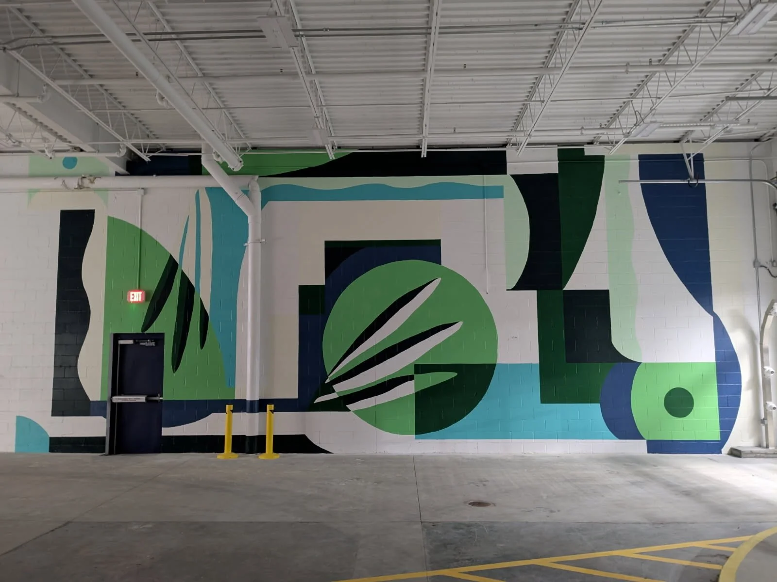
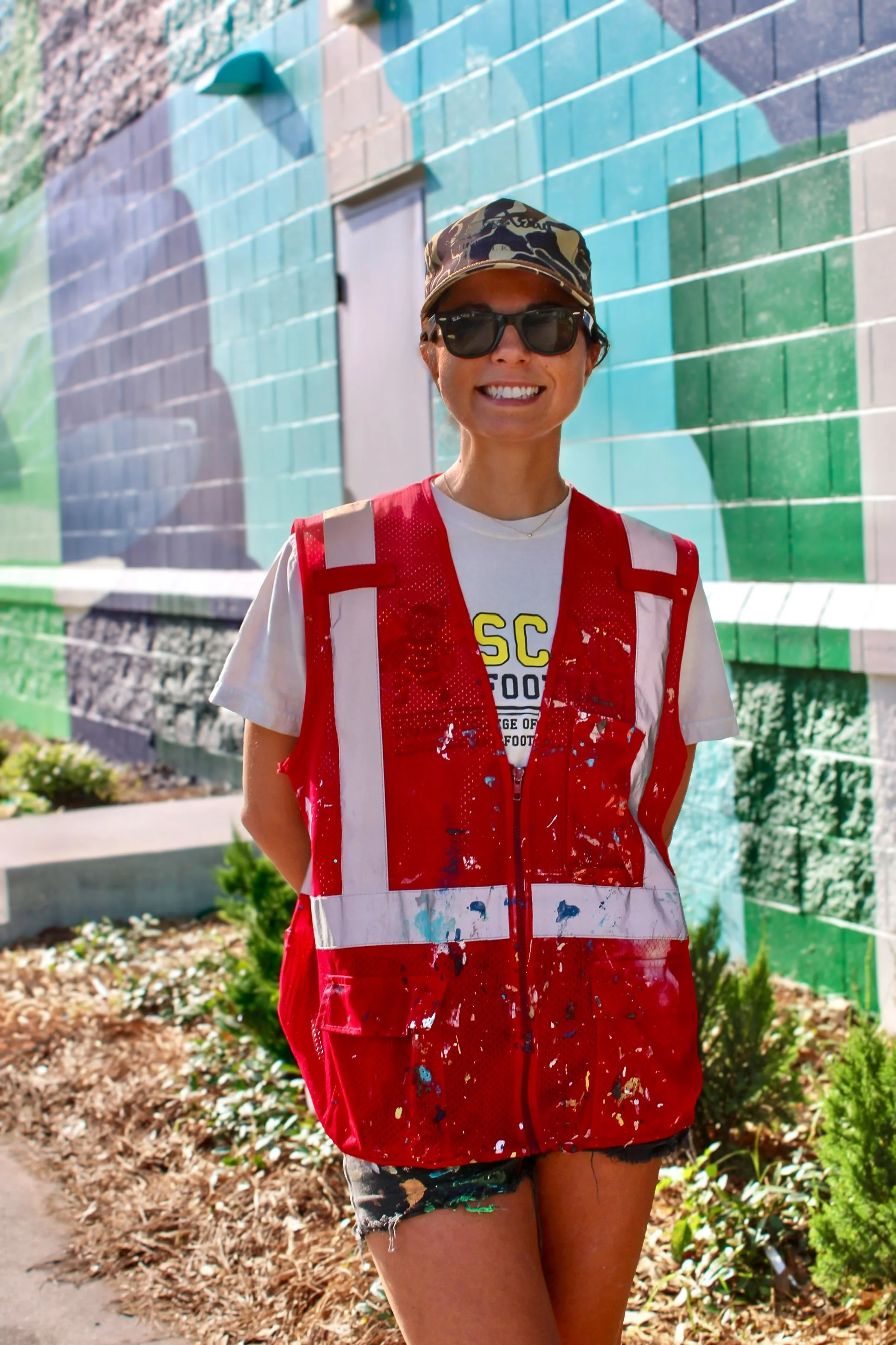
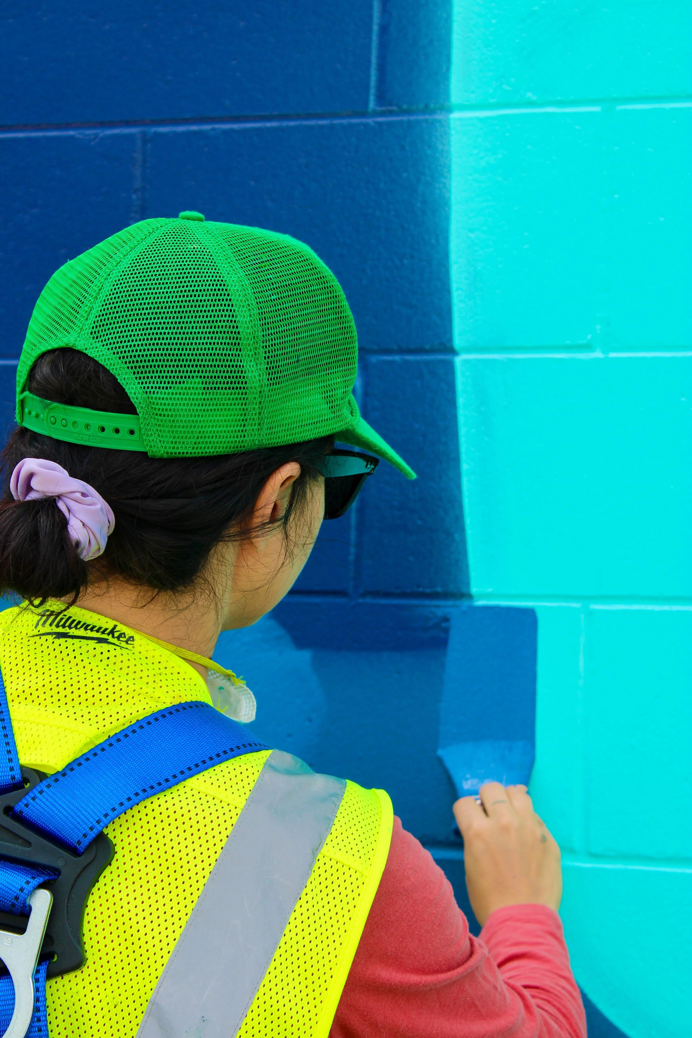
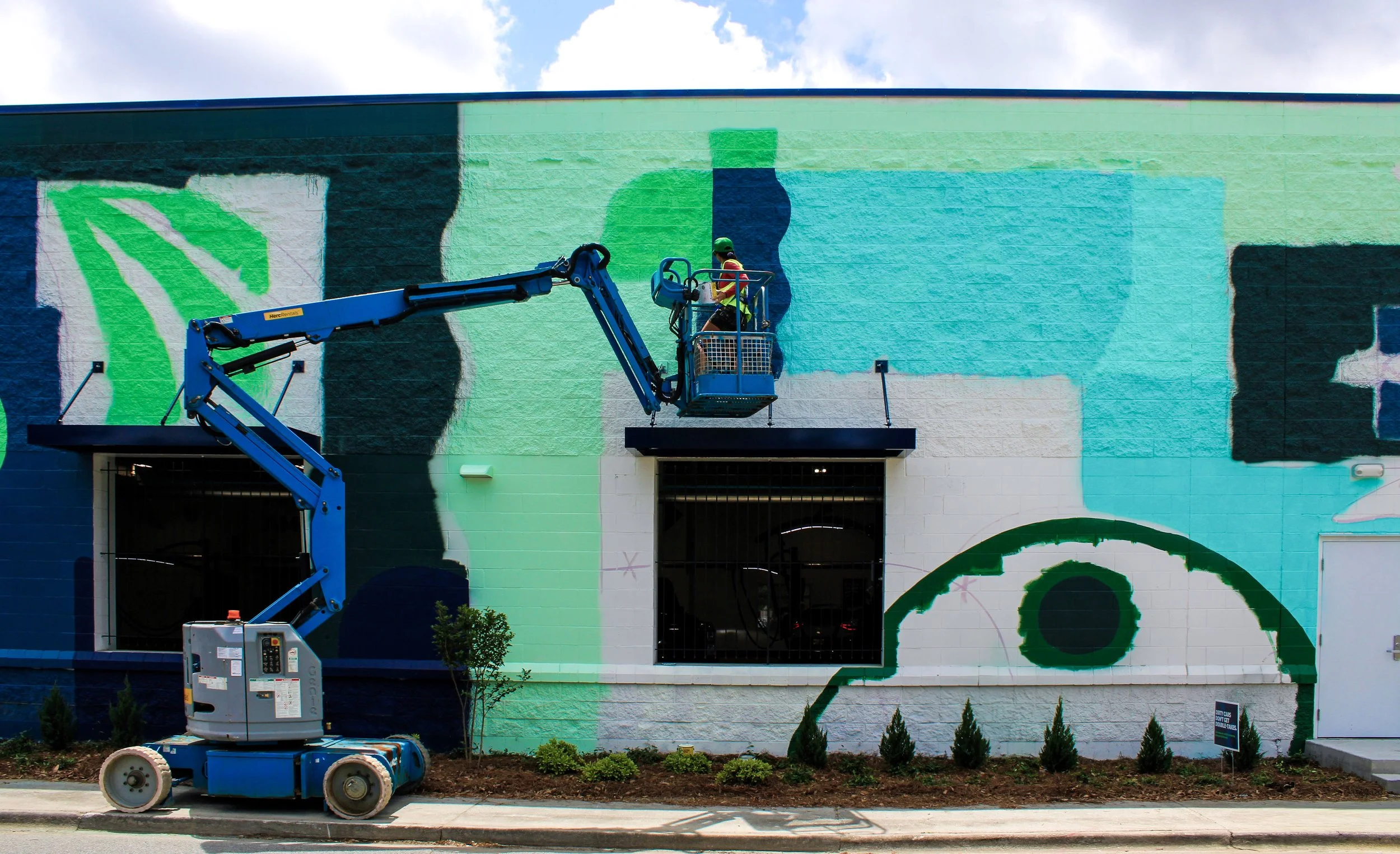
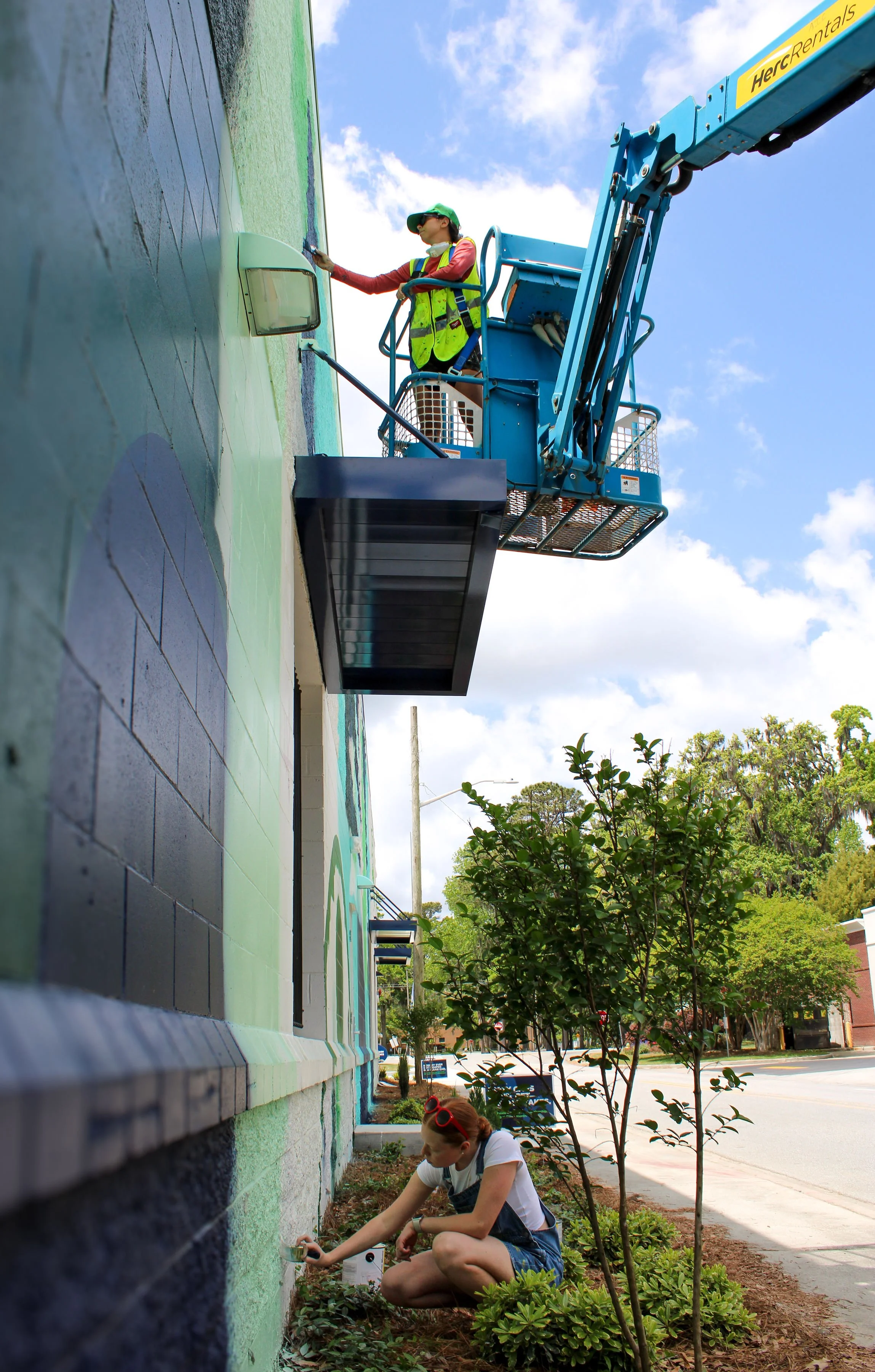
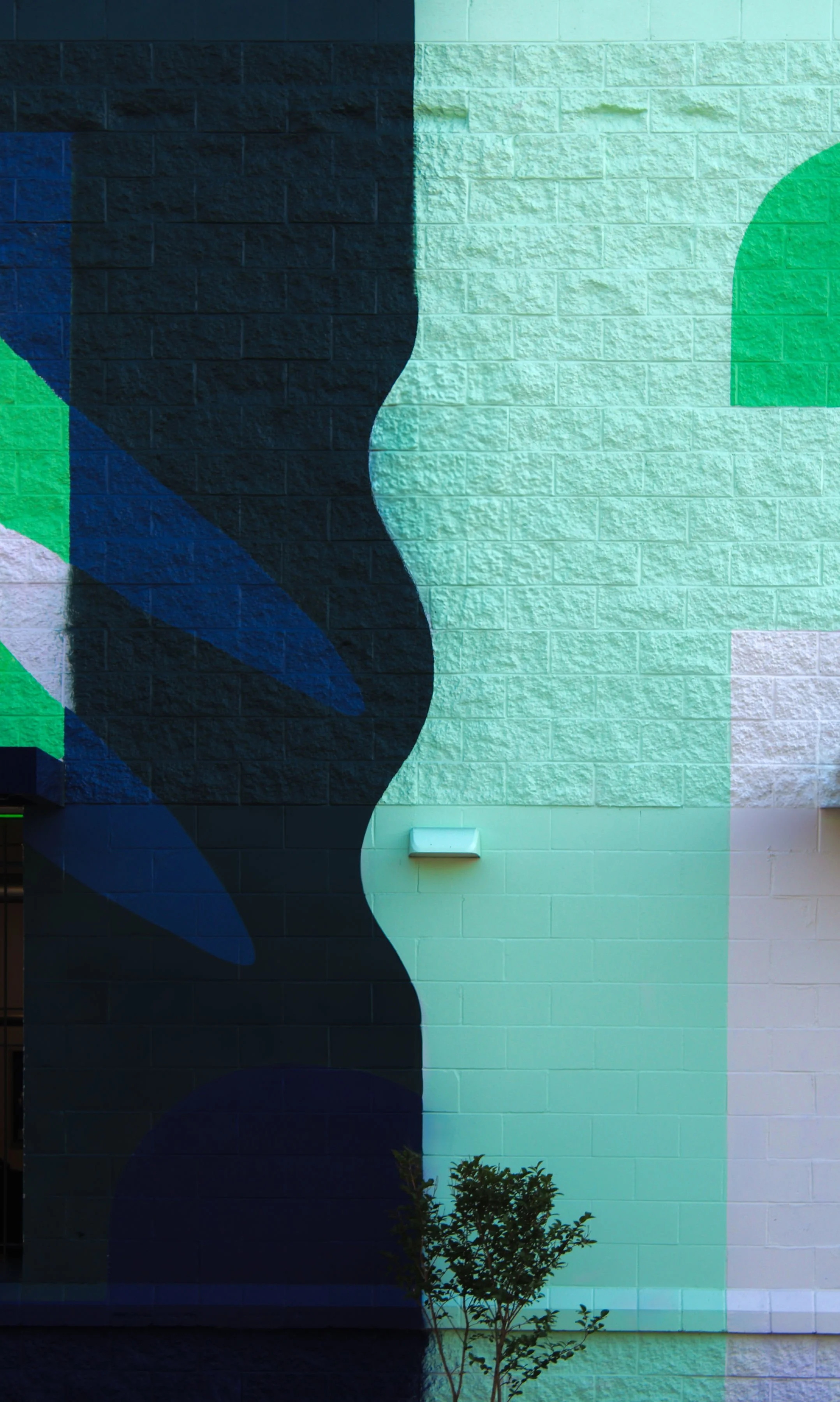
Juliana Lupacchino is a fine artist, and color is her medium. Her practice focuses on the way colors communicate with each other, and how they effect us—a celebration of beauty, color, movement, and human emotion.
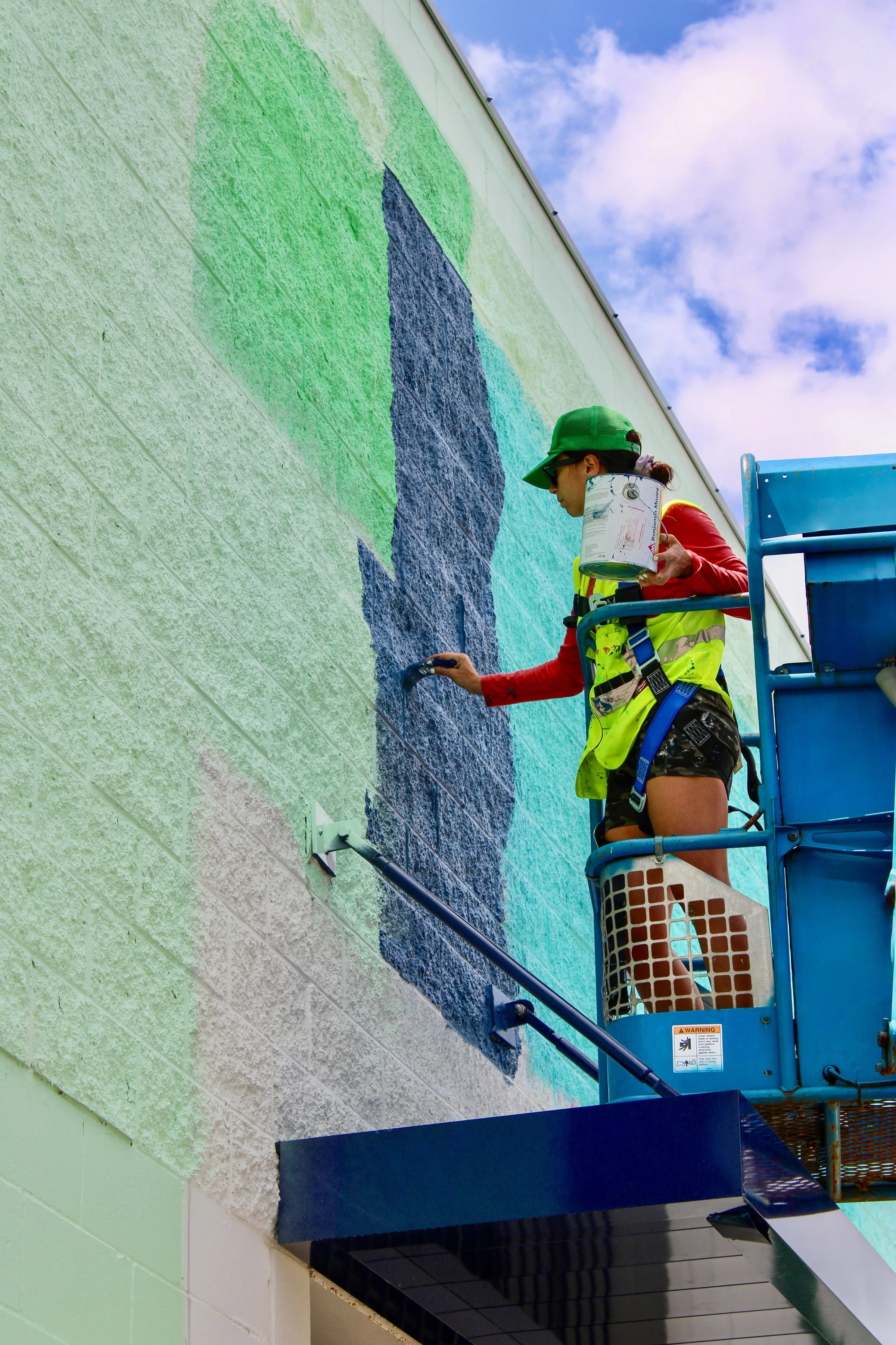
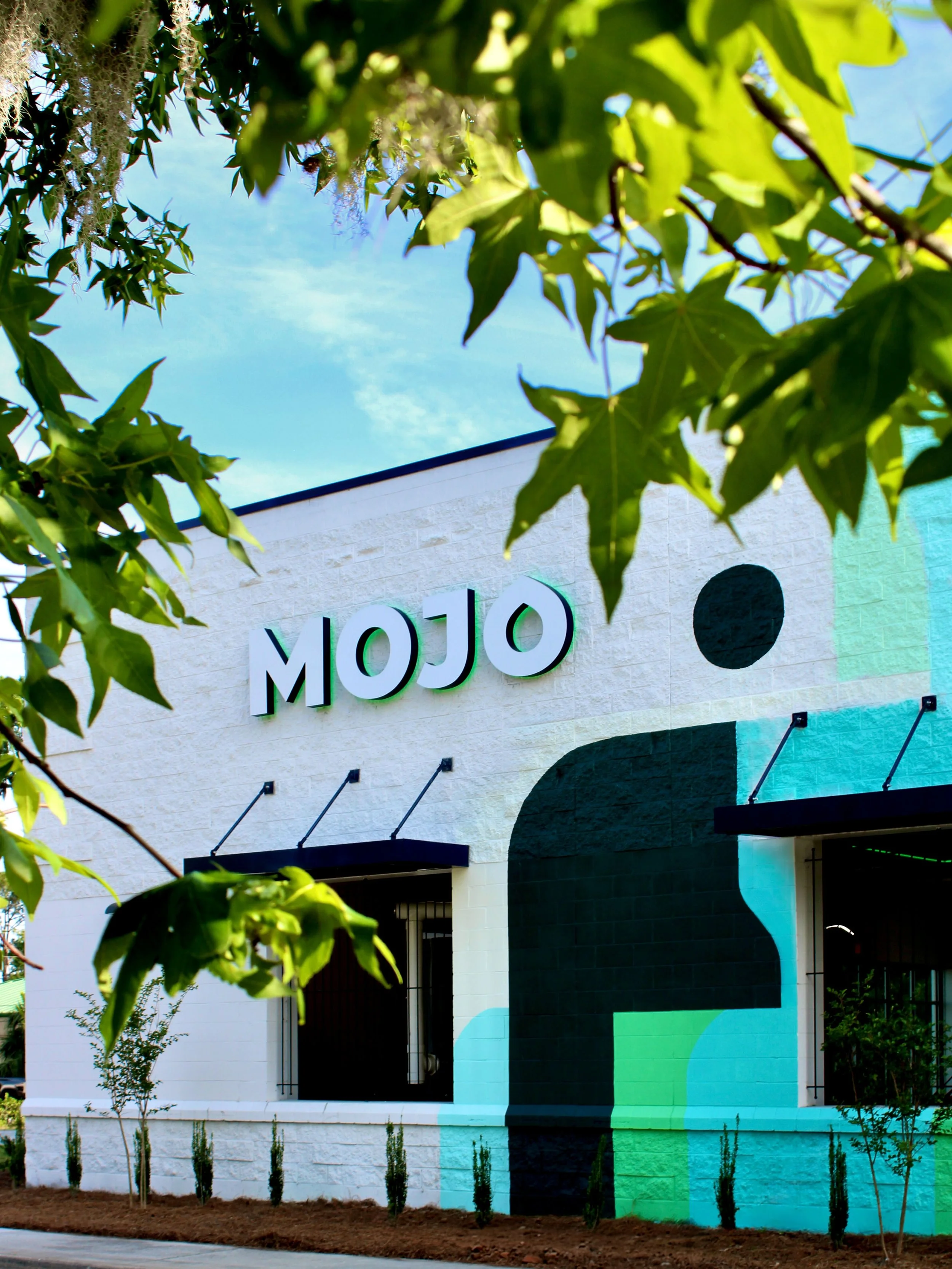
Her design approach for this project centers on celebrating shape and color, and how they interact within the JULU pattern, working with MOJO's specific brand colors. Her purpose was to give their brand a distinct voice and prominence through intentional placement. Because color is so relative, it’s important to pick the right placement for each color in each shape, so that the overall vibe is well conveyed.